

Slide-In Mobile Menu for Divi Pro
Customize how your mobile menu looks, behaves, and responds across devices.
PIXELROME – Slide-In Mobile Menu for Divi is a lightweight and performance-focused enhancement designed to replace the default Divi mobile navigation with a modern off-canvas experience.
Instead of relying on the standard dropdown menu, this plugin introduces a smooth right-to-left slide-in panel that feels more intuitive and aligned with today’s mobile UX patterns.
It integrates seamlessly with the Divi theme, automatically detecting and rendering your selected WordPress menu without requiring any complex setup.
The plugin offers practical customization options such as hamburger icon color, close icon color, menu background styling, typography control, spacing adjustments, and configurable menu width—allowing you to match the menu perfectly with your site’s design system.
With a clean codebase, no unnecessary bloat, and zero dependency on external libraries, the plugin ensures fast loading and reliable performance. Whether you're building a client site or refining your own brand presence, this plugin provides a simple yet powerful way to elevate the mobile navigation experience in Divi without compromising speed or maintainability.
Built for Divi Professionals
Whether you're building client websites, business websites, landing pages, or WooCommerce stores, Slide-In Mobile Menu Pro gives you the flexibility needed to create a polished mobile navigation experience.
Pro Features:
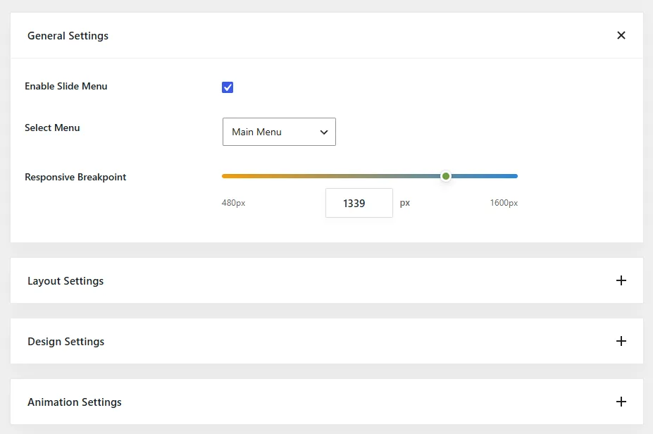
Custom Responsive Breakpoints:
- Choose exactly when your slide-in menu appears.
- Perfect for tablets, large phones, and custom responsive layouts.
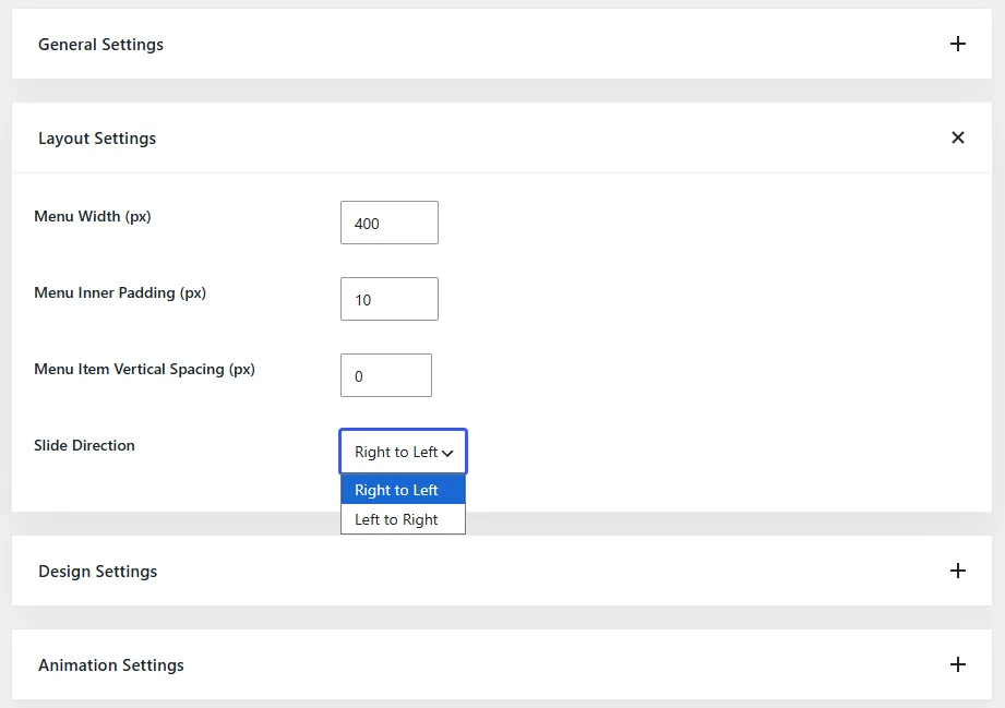
Slide Direction Control
Display the menu from either side of the screen.
- Right to Left
- Left to Right
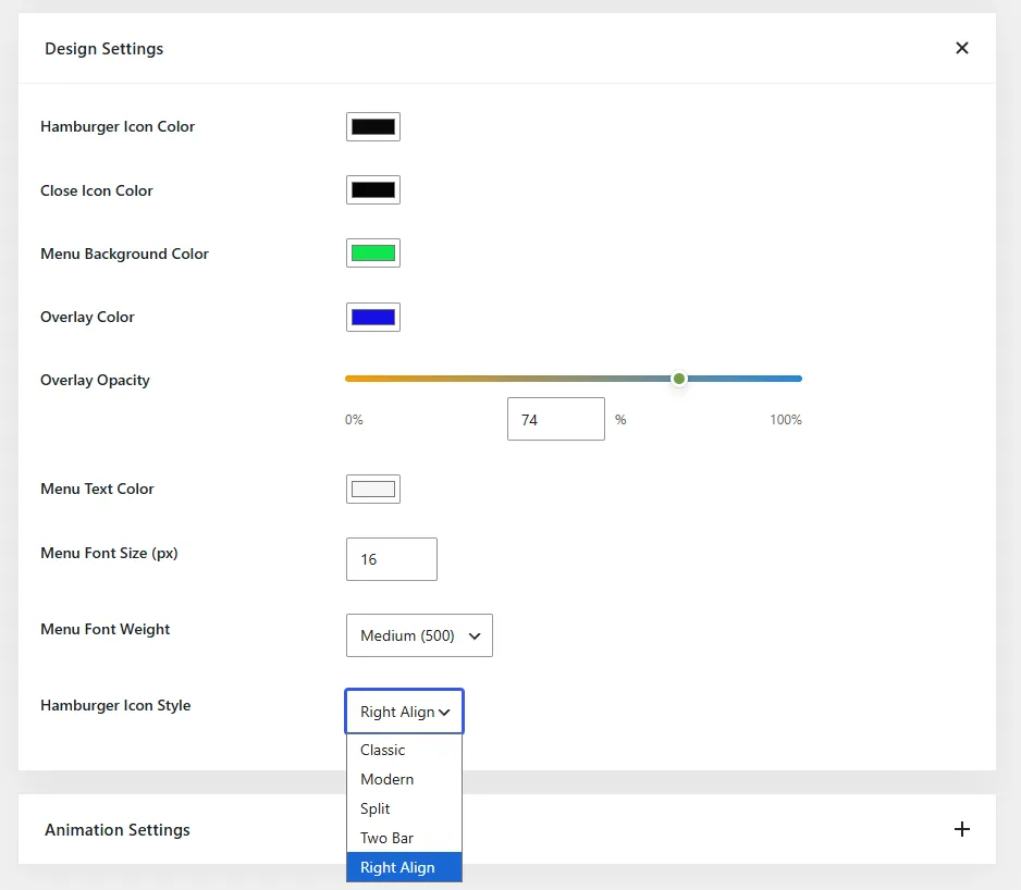
Modern Hamburger Styles
Choose from multiple hamburger icon designs to better match your website's branding.
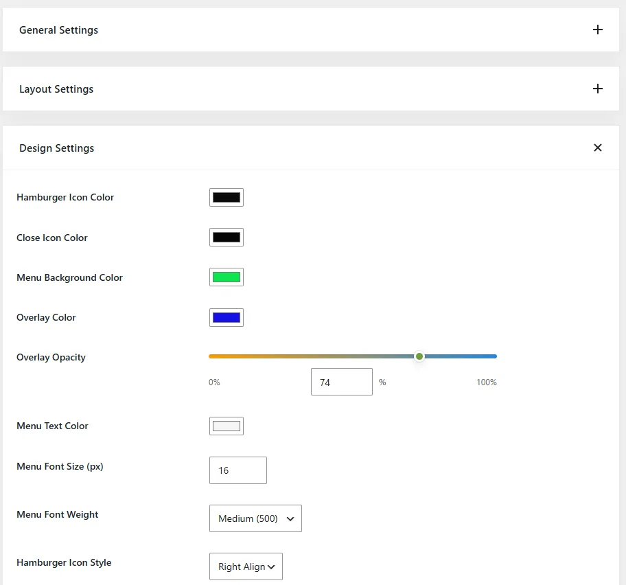
Overlay Color & Opacity Controls
- Customize the overlay that appears behind the slide menu.
- Create subtle or high-contrast menu experiences.
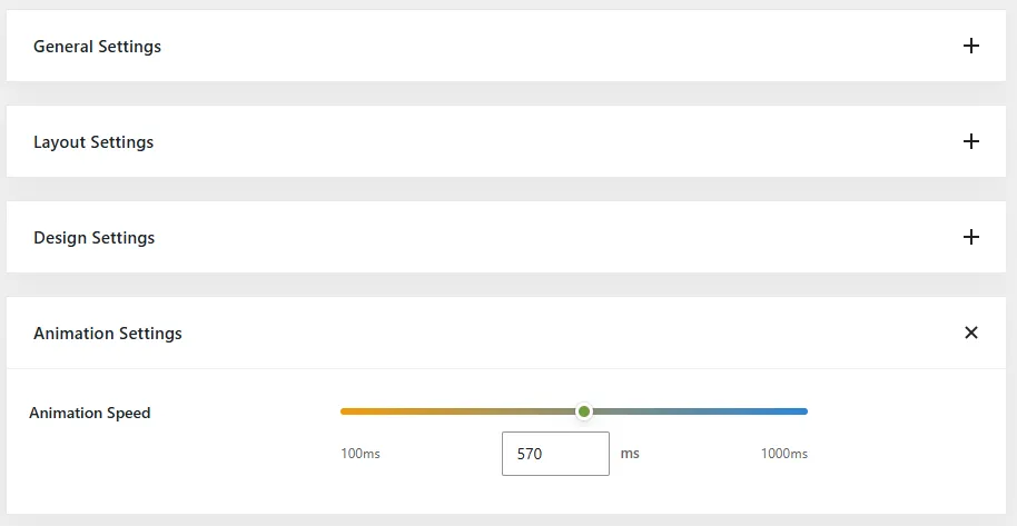
Animation Speed Control
Adjust the speed of menu transitions for the perfect user experience.
Future Premium Features
Your purchase includes future Pro updates and premium enhancements.
PRO Feature #1
Custom
Responsive Breakpoints
Control exactly when your mobile menu activates.
Choose your own breakpoint instead of relying on
a fixed responsive threshold.
PRO Feature #2
Slide Direction Control
Choose how your menu enters the screen.
Display slide-in menus from the left or right side
to match your website layout and branding.
PRO Feature #3
Modern Hamburger Styles
Go beyond the default hamburger icon.
Select from multiple icon styles to create a more
polished mobile navigation experience.
PRO Feature #4
Overlay Controls
Customize the backdrop behind your menu.
Adjust overlay color and opacity to create subtle
or dramatic visual effects.
PRO Feature #5
Animation Speed Control
Fine-tune menu transitions.
Create faster interactions or smoother animations
to match your site's design style.
Free vs. Premium
Slide-In Mobile Menu for Divi Pro
Compare the available features in the Lite and Pro versions of
Slide-In Mobile Menu for Divi.
| Feature | Lite | Pro |
|---|---|---|
| Slide-In Mobile Menu | ✓ | ✓ |
| Custom Menu Selection | ✓ | ✓ |
| Sticky Header Compatible | ✓ | ✓ |
| Menu Width Control | ✓ | ✓ |
| Menu Inner Padding Control | ✓ | ✓ |
| Menu Item Spacing Control | ✓ | ✓ |
| Menu Background Color | ✓ | ✓ |
| Menu Text Color | ✓ | ✓ |
| Menu Font Size | ✓ | ✓ |
| Menu Font Weight | ✓ | ✓ |
| Hamburger Icon Color | ✓ | ✓ |
| Close Icon Color | ✓ | ✓ |
| Responsive Breakpoint Control | — | ✓ |
| Slide Direction Control | — | ✓ |
| Modern Hamburger Styles | — | ✓ |
| Overlay Color Control | — | ✓ |
| Overlay Opacity Control | — | ✓ |
| Animation Speed Control | — | ✓ |
| Future Premium Features | — | ✓ |
| Priority Support | — | ✓ |
Pricing
Simple pricing with no subscriptions, hidden fees, or recurring renewals.
Slide-In Mobile Menu for Divi Pro
One purchase. All Pro features. Future updates included.- ✔ All Pro Features
- ✔ Custom Responsive Breakpoints
- ✔ Slide Direction Control
- ✔ Modern Hamburger Styles
- ✔ Overlay Color & Opacity Controls
- ✔ Animation Speed Control
- ✔ Future Premium Features
- ✔ Priority Support
Frequently Asked Questions
Everything you need to know before upgrading to Pro.
What is Slide-In Mobile Menu for Divi Pro?
Slide-In Mobile Menu for Divi Pro extends the Lite version with advanced customization controls, allowing you to create a more flexible and branded mobile navigation experience for Divi websites.
Do I need the Lite version to use Pro?
No. Slide-In Mobile Menu for Divi Pro is a standalone plugin. If the Lite version is active, it will be automatically deactivated when Pro is activated to prevent conflicts.
What do I get with my purchase?
Your purchase includes the Pro plugin, future updates, compatibility improvements, premium features, and priority support.
Will I lose my settings when upgrading from Lite to Pro?
No. Existing menu settings and configuration will remain intact when upgrading to Pro.
Can I choose when the mobile menu appears?
Yes. Pro includes custom responsive breakpoint controls, allowing you to define exactly when the slide-in mobile menu becomes active.
Can I change the direction of the menu panel?
Yes. Pro allows the menu to slide in from either the left or right side of the screen.
Can I customize the appearance of the menu?
Yes. Pro includes additional controls for hamburger styles, overlays, animation speed, and other visual customization options.
Does the plugin work with Divi Theme Builder headers?
Yes. The plugin is designed to work with both standard Divi headers and Divi Theme Builder headers.
Does the plugin support sticky headers?
Yes. The plugin works with Divi sticky headers and maintains proper behavior across desktop and mobile layouts.
Will the plugin slow down my website?
No. The plugin is lightweight and optimized specifically for Divi websites, loading only the assets required for functionality.
Is there a free version available?
Yes. PIXELROME – Slide-In Mobile Menu for Divi is available free of charge and includes the core functionality required to replace Divi's default mobile menu with a modern slide-in navigation experience.
Will more features be added in the future?
Yes. Slide-In Mobile Menu for Divi Pro is actively developed and new premium features will continue to be added over time.